Originally posted on Achieve.
What is your company’s brand? Is it your logo? Is it your writing style? What does it take to have a strong brand and why is it important? These are some of the most challenging marketing questions that a nonprofit can face, and navigating brand identity can be a frustrating process. Creating and maintaining a strong brand is a complex beast, but there are a few simple things that you can do today to help strengthen your brand.
Consistency is Not Boring – It’s Powerful
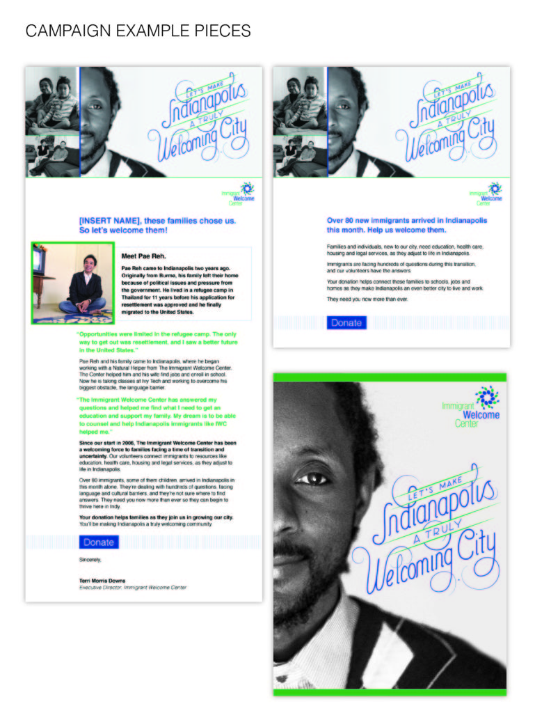
Think about Coca-Cola for a minute. What comes to mind? I’m sure one of the first things that you think of is red. Then, maybe the iconic scripty logo? Then, maybe polar bears? Why does your brain immediately connect all of those images immediately with Coke? The answer: branding. Coke has made an incredible effort to promote a strong, consistent brand for decades. Coke has created a “share of mind” that exists worldwide where people associate Coke with their brand elements; however, it is a process that takes time, patience and unwavering dedication to consistency. Do you remember when Coke tried to rebrand to a more contemporary logo in 1985 and the universe seemed to revolt against it? It is commonly recognized as one of the biggest branding mistakes of the 20th century. The moral of the story: New is not always better – often consistency is more valuable than newness. Here is an example of consistency across several pieces in an awareness campaign:

Create an Email Template
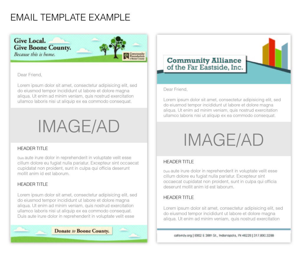
One of the simplest ways to implement a consistent brand is by creating an email template for all of your email communications. The easiest way to do this is to hire a designer to create header and footer email banners for your organization where you can update the content on a regular basis depending on what you want to communicate to your constituents. That way you are committed to a similar look and feel throughout all communications, but still able to develop new content for each email. Below is a couple of examples of simple email templates that can be used for communications:

Create A Style Guide
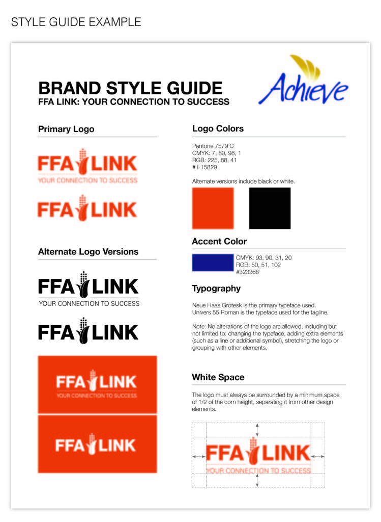
For many nonprofits, at some point in time, a logo was created, but there was no style guide or brand strategy developed with it. More often than not, this results in a mishmash of colors, typography, design styles, and writing style that can change dramatically between different marketing pieces. The first step to avoiding this confusion is creating a simple list of the colors and typography that your organization should use. This guideline should be implemented into all of your materials, both internal and external. The key components of a style guide are colors, typography, logo use, writing style, and words to use/not use. Here is an example of a basic logo style guide:


