Originally posted on Achieve.
Rotating banners are an opportunity to show your user more information when they land on your website, right? Wrong. But how can I give them what I want them to know about our mission, programs, and current events if I don’t have rotating banners? We get it – it is hard. It is more difficult to create one clear and concise message that encompasses all that you want to say rather than write a three-page document about your organization. Simplicity and clarity is a tough exercise, especially when you are providing your constituents so many great services – but that’s another blog post. For now, we wanted to share with you some of the top reasons to shy away from rotating banners on your website.
Users Suffer from “Banner Blindness”
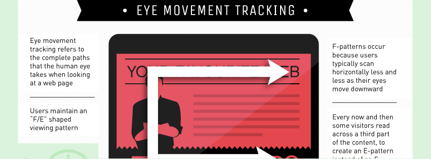
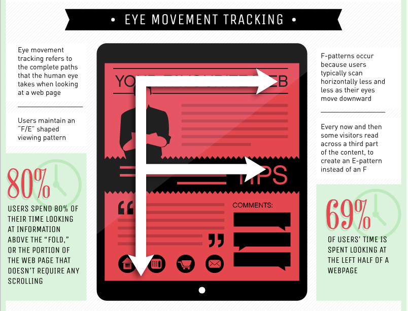
The sad fact of the matter is that users tend to “tune out” elements that are moving on a web page. We have been trained that anything moving is an advertisement and often times the banner moves too quickly for the user to read anyway. So where do users look? Nielsen Norton Group found that users are most attracted to text and faces. When reading the text, we typically see users skimming down the left side of the page. The rule that the eye travels in an “F” pattern tends to prove true across the board. In fact, Crazy Egg found that 69% of users’ time is spent on the left half of the page. Take a look at the full infographic here.
Users Like to Have Control
Why do website users like to have control? One of the primary reasons is because it builds trust between them and the organization. Users like to find the information they want when they want it. Users quickly become skeptics of an organization when they feel as though the information is being forced upon them; they feel as though they are only getting part of the story. The more control, transparency, and information that you give users, the more they will trust you.
For a quirky illustration of this concept, take a look at this on shouldiuseacarousel.com.
Users Don’t See All of the Banners
When we do see users clicking on rotating banners, the only clicks we typically see are on the first banner, which is still only about 1% of those who land on your website. Like I mentioned earlier, it’s tough to create clear and concise messaging on your homepage, so take some time to sit down and think about what is most important to include. Keep in mind that if you are trying to draw attention to too many elements on your home page, those elements will all begin to get lost because they are competing for attention. Think about the one main thing you want your users to do when they get to your website and make that the visual focus.