Originally posted on Achieve.
Last month, we heard from some incredible individuals at MCON 2015. I know that I speak for all of us when I say I left inspired to change the world. With organizations like Knight Foundation, Upworthy, Baltimore Corps, Levi Strauss Foundation, KIND Snacks, National Geographic and more, we had the privilege of hearing from the best and the brightest on how to activate people for good.
After leaving that experience, I began researching some of the ads and campaigns that these organizations are using to motivate their audiences to action and, not surprisingly, found several great examples of using design for good. Here are a few things that we learned:
Use Photos of Eyes for an Emotional Connection to Your Audience
One of our presenters, Anna Palmer, started an organization called the Fashion Project where people can donate clothes and accessories to the organization and once they resell them, 55% of the proceeds go towards a charity. The Fashion Project partnered with another organization called “Look Good Feel Better,” helping women with cancer feel good about themselves as they go through the treatment process. The images below are from their campaign.
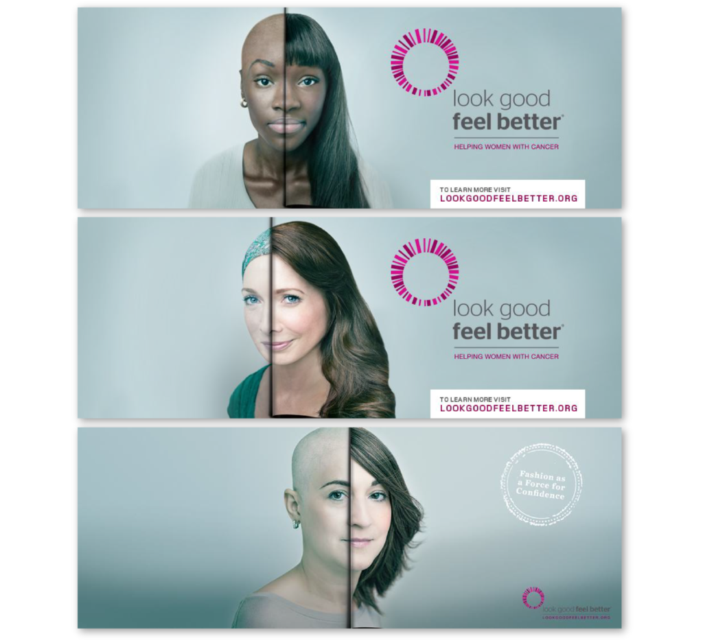
One reason why these images are so powerful is that someone can glance at these for a couple of seconds and know immediately what it is that the organization is hoping to accomplish. The general public understands that being bald is often associated with cancer treatment and by pairing that with the other half of the image the viewer has a clear idea of the organizational objective. Another way that this ad campaign is effective is that it focuses on the eyes and faces of real people. Your audience can tell when you are using stock photography. They also empathize and connect more with a person if they can see their eyes; this is an incredibly powerful and important part of human connection.
Clarity is King
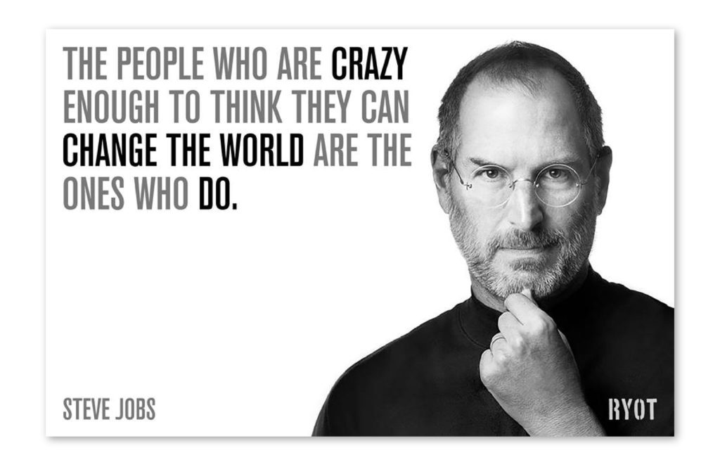
Hayley Pappas joined us for Cause for Design, an off-shoot of MCON that took place on June 26, 2015. Cause for Design is a summit on how to activate people for good through design. Hayley showed us ways in which RYOT uses news and film to activate people for causes. We watched several videos that highlighted current events and the seriousness of that issue but also left us feeling hopeful about what we can do to get involved and help the cause. Although RYOT primarily does journalistic reporting, they also have examples of great ways of activating people through ads. The one below was an image that they simply posted on Facebook as an inspirational message and the reason we liked it is because it has one clear message that resonates with just about everyone. They mastered the balance between simplicity and clarity.
Be Consistent Across all of Your Collateral
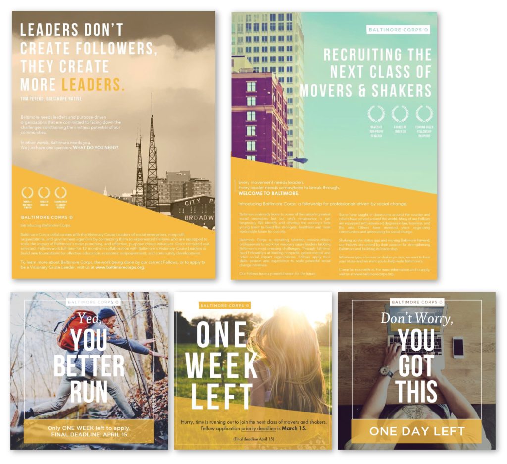
Not all campaigns have to be serious and directly about the cause you are helping, sometimes it’s important to just get your message across clearly and consistently. Fagan Harris is the CEO of Baltimore Corps, an organization that activates leaders in the city to lead in its growth and development. They created a campaign where they were collecting applications for their fellows program and did a great job at designing a variety of pieces. Some had more information so that the audience could read more about the program if they wanted to, but they also paired those with really simple clear graphics reminding their audience of the deadline. The campaign started with the information-heavy pieces and as the deadline got closer they just focused on creating urgency around “apply now.”
Sometimes All You Need is Text
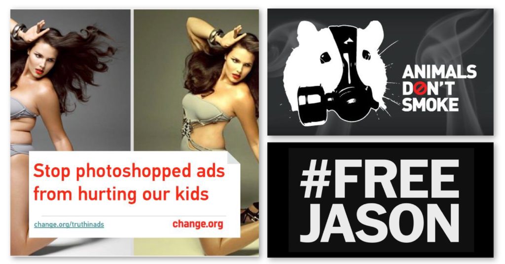
Another one of our speakers at Cause for Design was Justin Lyons from Change.org. Change is one of the most powerful platforms for peer-activation for a cause and he showed many examples of ways that organization has brought light to an issue. Since they have a lot of difference causes that they are promoting, it is not uncommon for them to only create one or two ads per cause. This creates a unique challenge where they have a very limited amount of exposure time per ad, however, they have done an amazing job at using text with minimal photos/graphics to get their message across, but also keep each ad unique. Below are a few examples of ways they have been effective in this approach.
Make Your Audience Laugh
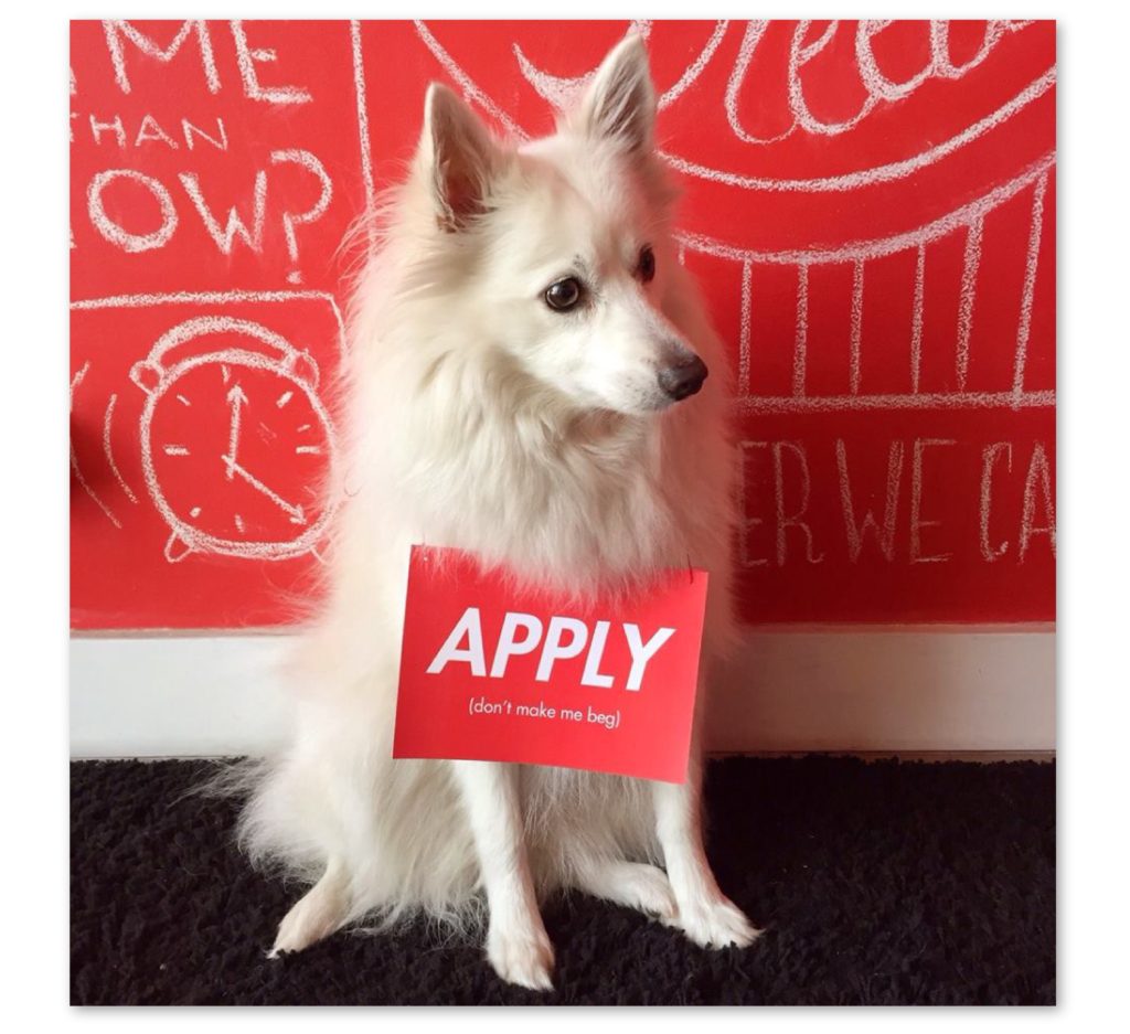
One of our favorite organizations for using humor in their campaigns is LiNK – Liberty in North Korea. LiNK is focused on helping North Korean refugees, which is a heavy and near impossible cause because of all of the roadblocks that they face on a daily basis. However, the organization does a great job at keeping their messaging positive and even light-hearted. We’ve seen in throughout most organizations that being optimistic is a better way to activate your audience than showing them how destitute the situation is. LiNK is a perfect example of using optimism and humor to their advantage.
