Originally posted on Achieve.
When I first heard Ethan Marcotte speak on the topic of responsive web design in 2011, I remember the whole room being filled with a thick layer of wonder as we all mulled over what this meant for the web industry.
To say the least, we were in awe.
Arguably, Marcotte did not invent responsive web design; however, he did coin the term and help cultivate conversation around things like fluid grids, media queries and flexible images.
The first website that he tested his concept on was The Boston Globe, which was a perfect test case. Websites for news publications hold a ton of content. And through responsive design, he was able to make all of this information digestible to any reader no matter what device they were using.
For those who are less experienced in responsive design, let me offer you a quick starting course.
What is Responsive Design Anyway?
Like most designers, I tend to geek out over the history of web design and how it has changed over the past decade, starting as something similar to the printed page and evolving into a medium adaptable to many environments. But I will not bore you with all of that background. For our purposes, the main thing you need to know is:
Responsive web design is the ability for a website to change the placement and format of content based on the screen size of the device being used.
It’s much easier to envision this concept visually, so here are the differences between a website seen on a mobile device, tablet and desktop.
Responsive Web Design Condenses Information for Smaller Screens
You don’t necessarily lose content on the smaller screens, but you can condense how the information is presented. For example, if you notice in the above graphic in the top right corner, there is an option to search the website.
On the desktop and tablet versions, the search includes the word “search,” a search box and the search icon. In the mobile version, only the icon is included. We know that users like to search, so the information is still there, but the search icon is familiar enough to people that they can intuitively know what that means without spelling it out.
Why Should I Care About Responsive Web Design?
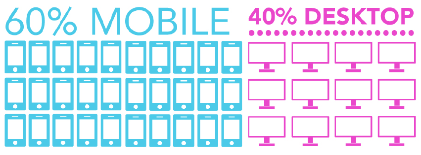
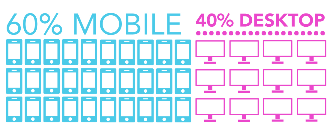
When mobile usage surpassed desktop in 2014, Techcrunch noted that “Combined with mobile web, mobile usage as a whole accounts for 60% of time spent, while desktop-based digital media consumption makes up the remaining 40%.”
So the short answer is because your donors and constituents are using mobile devices, then you should care.
“If your donors and constituents care, then you should care.”
But that’s not all! There are a ton of additional benefits to your organization that will help you be more successful when you adapt to responsive web design.
1. Add an Image or Blog Once and Your Website Does the Rest
When your website is responsive, you upload your content and the website adapts that content to each device format. You don’t need to do anything special, you upload a photo or blog post once and your website does the rest of the work.
2. It Will Be Easier to Donate and Register
Who doesn’t want better engagement and more money for their organization? By switching to a responsive web design, you are creating a more user-friendly experience for your donors and thus increasing the likelihood that they will complete their transaction.
3. You Will Increase Credibility and Professionalism
Like it or not, the people coming to your website judge your credibility and professionalism within seconds of hitting your homepage. And they are not just judging your website; often times this is the first impression that they have of your entire organization. You know that in order to build loyalty and trust among your users, professionalism is key. When your website is responsive, you are signaling to your users that you are on your A-game, not only with your website but in all areas of your organization.
4. Users Will Stay on Your Website Longer
Responsive websites take into account how the user is navigating your website on that particular device, which means information will be easier to find. If information is easier to find then users will stay on your website longer. This is a good thing because the more they know about your organization, the more they will fall in love with you!
5. You Will Show Up Better in Search Results
As of April 21, 2015, Google made changes to their search engine and will drop the search ranking for websites that are not mobile-friendly or responsive. Don’t lose the spot that you’ve created for yourself in search results just because your website is not responsive! It takes time and patience to get to the top of the page when users search and having a responsive website will boost those efforts.


